-
PROJECT: Mac & Emma - Responsive Website
-
ROLE: Research, Visual design, Prototyping, Branding
-
DURATION: June 2022-July 2022
-
Project Vision
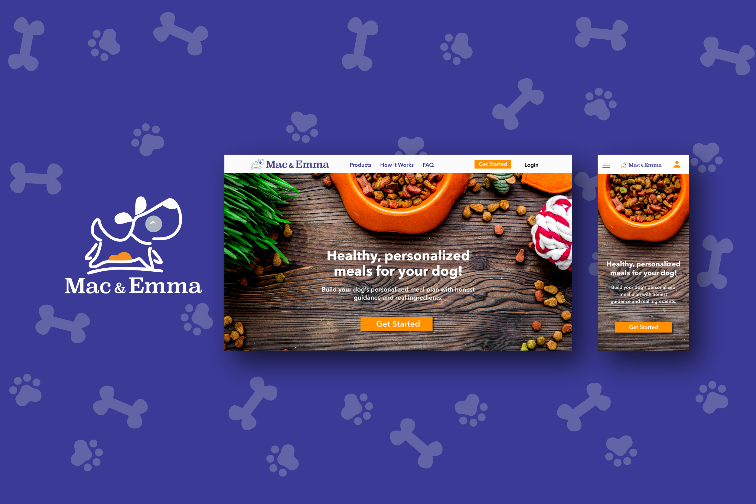
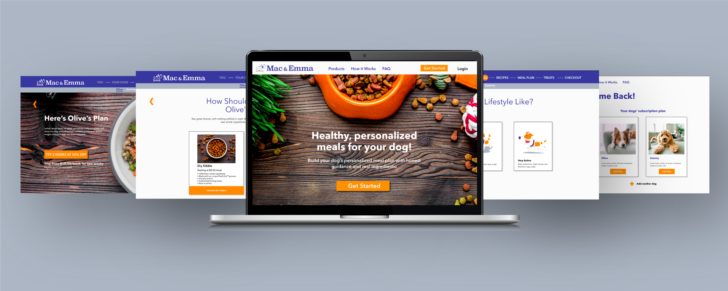
Mac & Emma is a subscription dog food vendor that was created for dog owners who are looking for nutritious, high-quality dog food that can be delivered to their homes on a schedule. The website should help users determine the best food choice and delivery schedule for their pet based on the gender, breed and overall health of their dog.
-
Challenges
Create a seamless and linear subscription process.
Design a cohesive interface for familiar and unfamiliar users.
Create a user experience that encourages repeat visitors.
Create a tone that comforts and encourages dog owners.

User Research
I conducted interviews and created empathy maps to understand the users I’m designing for and their needs. Two primary user groups were identified through research. The first, working adults with families and that want one less item on their to do list. The second, dog owners who want high-quality pet food, not from a pet store and who aren’t concerned with the extra delivery fees
These user groups confirmed initial assumptions about a dog food vendor’s customers. Other pain points that were discovered included, delivery consistency, food quality, high delivery fees and subscription experience.
Pain Points
Delivery Consistency
It is very important that deliveries are made on time. Late deliveries would mean that users would need to find a local store to supplement while paying additional costs
Subscription Experience
It is important that the flow of the initial subscription process is not tedious. Users will exit before completing the sale. Making changes to an existing account can be frustrating and leads to account cancellations.
Food quality
Dietary needs are present for many dog owners. Not knowing the ingredients of their dog’s food is an issue.
High delivery fees
It’s disappointing to have additional fees added to the final price. This can deter a user from completing the subscription.
Meet the Users
-

Cathy
Age: 40
Education: BS
Hometown: Highland Heights, OH
Family: Married with 3 children and 2 dogs
Occupation: Marketing ManagerCathy is a working wife and mother of three children and two dogs who needs an easy and affordable way to order her pet’s food online and have it delivered to her home once a month because she would like to avoid having to run to the pet store which is out of her way.
-

Richard
Age: 67
Education: Doctoral
Hometown: Chicago, IL
Family: Married with 3 dogs
Occupation: Retired DentistRichard is retired husband and father of three dogs who needs a way to order high quality, nutritional pet food online and have it delivered on a schedule because he does not like pet stores or their products, also he prefers to have a pre-scheduled delivery each month.
Competitive Analysis
My goal was to compare offerings and functionality of competitors dog food subscription websites. I looked at several brands that offered subscription and delivery services. We narrowed it down to three direct and one indirect competitor. After reviewing each of the competitors’ websites I found a few gaps in the market which leads to opportunities to stand out.
Opportunities to stand out:
Offer free or reduced cost delivery for subscribers
Offer the ability to purchase item without having a subscription
Research and consider what accessibility functionalities would serve our audience best
Preparing the journey
I constructed a user flow of what a basic start to finish journey looks like for a user subscribing to the dog food subscription plan. This helps me in understanding the ways a user can interact with the product, as well as allowing me to see user goals through navigation.
Wireframes
Paper
My goal during the wireframing stage was to iterate quickly. I was able to sketch out various versions of each proposed website page. From these iterations, I was able to narrow down the layouts quickly. This exercise allows me to move into digital wireframing with a solid strategy.
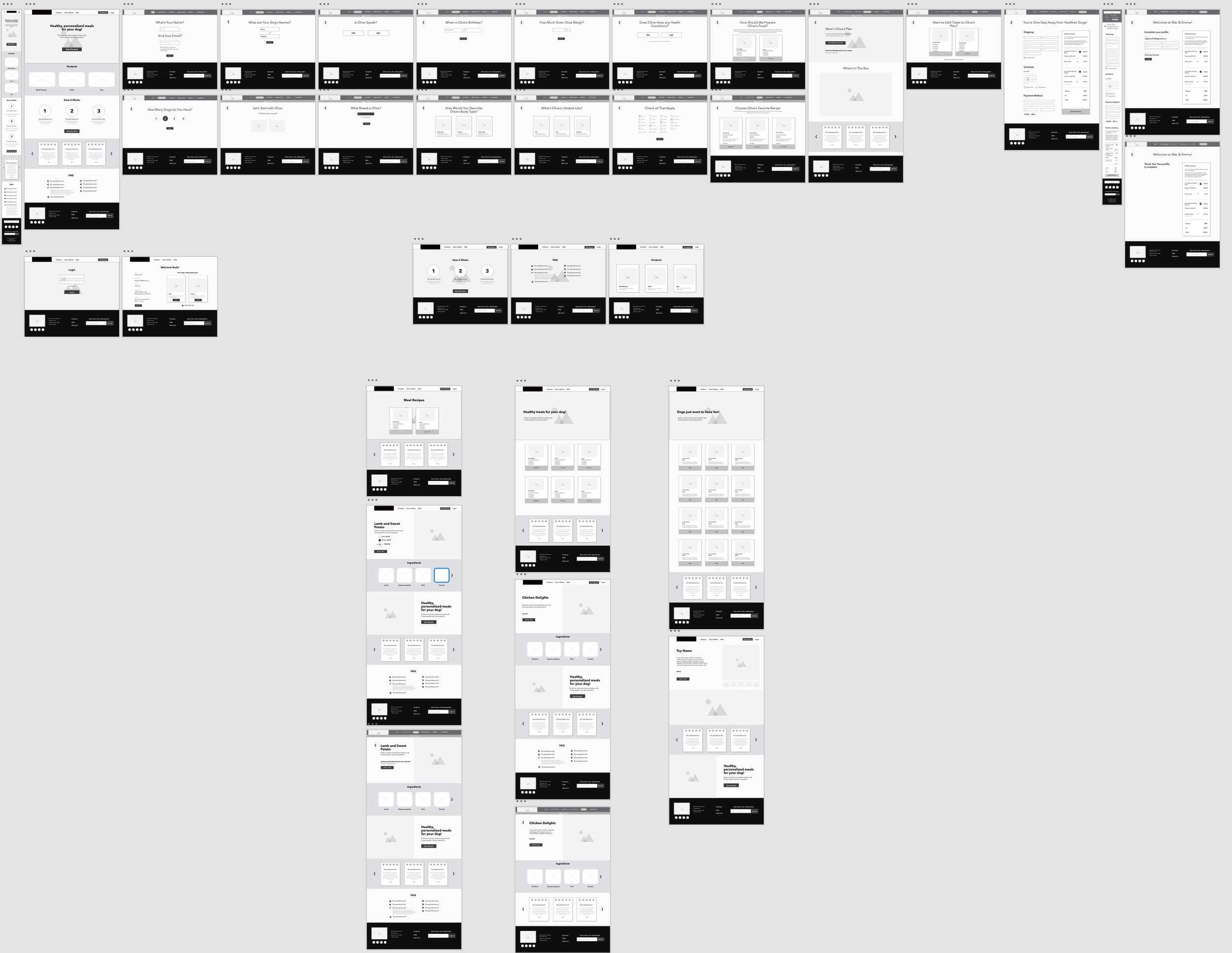
Digital
Low-fidelity prototype
The user flow starts on the welcome screen and moves through the subscription process and then to payment and delivery scheduling.
Usability Study
The first round of testing was conducted with (5) participants. They were asked to accomplish (6) tasks using the low-fidelity prototype. I observed them and took detailed notes of how they reacted to the app. There were also open-ended questions asked of the participants after completing each task.
Insights:
Based on the theme that some participants want to be able to purchase items without a subscription, a separate checkout page with cart needs to be added.
Based on the theme that the majority of participants want payment options, an insight is that the app needs to offer a variety of payment methods.
Based on the theme that the there wasn’t a page dedicated to the recipe options, an insight is that a page needs built to allow all of the recipe options to be displayed as cards.
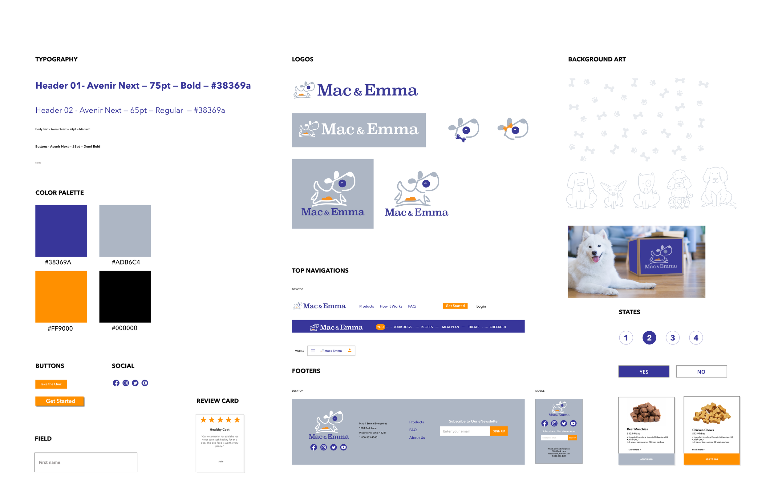
Style Guide

Takeaways
Mac & Emma was an interesting project because the main focus of this website was the subscribtion quiz. The idea was to be able to collect all the details needed for the personalized meal plan while keeping the UX of the quiz pages quick, clean and simple. We didn’t want to lose potential subscribers half way through the quiz and not get them to checkout. The tone had to be light and cheerful while also showing concern and care for the pet’s health. I really enjoyed the visual design portion of this project. I was able to select the color palette and design the branding for the site.


