-
PROJECT: Every Voice Ohio - Dedicated Mobile App with Companion Responsive Website
-
ROLE: Research, Visual design, Prototyping, Branding
-
DURATION: June 2022-July 2022
-
Project Vision
Every Voice Ohio is a nonpartisan, nonprofit dedicated to helping register Ohioans to vote. The goal is to create a multi-platform tool for a diverse group of users. Adults of every ability and background need to be able to access and use this tool easily and efficiently to register to vote.
-
Challenges
Create a seamless and linear registration process.
Design a cohesive interface for familiar and unfamiliar users.
Create a user experience that accommodates users of all abilities and backgrounds.
Create a tone that educates and encourages.

User Research
I conducted interviews and created empathy maps to understand the users I’m designing for and their needs. Two primary user groups were identified through research. The first, young adults of voting age that need assistance with registering to vote because they don’t understand the process and don’t have regular access to the internet. The second, middle–aged adults who recently earned their citizenship and need help registering to vote because they are unsure of where to get voter information and have anxiety with filling out paperwork in a language that isn’t their native language.
These user groups confirmed initial assumptions about citizens who are not registered to vote in Ohio. Other pain points that were discovered included, distrust of information on the internet, lack of internet access, language barriers and process confusion.
Pain Points
Distrust of information on the internet
It is very important that the information provided is trustworthy and is consistent with state and federal laws.
Language barriers
Users who have a different native language find it difficult to complete the registration process. It is important that this platform is multilingual.
Lack of access to the internet
Some users do not have consistent or reliable access to the internet.
Registration process confusion
Users get frustrated with over-complicated forms.
Meet the Users
-

Briana
Age: 21
Education: Highschool
Hometown: Akron, OH
Family: Mother, 2 brothers
Occupation: HousekeepingBriana is a 21-year-old high school grad who works as a full-time housekeeper at a local hotel. She has put off registering to vote because she doesn’t understand the process and she doesn’t have regular access to the internet. She does have a smart phone and is looking for an app to help her register online. Her other family members do not vote, but Briana thinks its very important to take advantage of her right to vote.
-

Luis
Age:52
Education: Highschool
Hometown: San Germán, Puerto Rico
Family: Married with 3 children
Occupation: Diesel MechanicLuis is a 52-year-old immigrant who just became a fully naturalized U.S. citizen along with his wife. He works long hours as a diesel mechanic at a local transportation company. He is not great with technology and doesn’t use a smart phone. He wants to register to vote before the next election. He is unsure of where to get information and is looking for some assistance with the process. He is ok with registering online but would like to vote in person.
Competitive Analysis
My goal was to understand the voter registration process and then find ways to make it more approachable and less intimidating. I looked at a few platforms that offered registration. I then narrowed it down to three indirect competitors. After reviewing each of the competitors’ platforms, I found a few gaps in the market which leads to opportunities to stand out.
Opportunities to stand out:
Offer a registration process that took less than 3 minutes to complete
Offer a multilingual registration form
Research and consider what accessibility functionalities would serve our audience best
Wireframes
Paper
My goal during the wireframing stage was to iterate quickly. I was able to sketch out various versions of each proposed app screen. From these iterations, I was able to narrow down the layouts quickly. This exercise allows me to move into digital wireframing with a solid strategy.
Digital-Dedicated Mobile App
Digital-Companion Desktop Website
Low-fidelity prototype
The user flow starts on the homepage and moves through the registration process. The user can also check their registration status, donate and register to volunteer.
Usability Study
The first round of testing was conducted with (5) participants. They were asked to accomplish (6) tasks using the low-fidelity prototype. I observed them and took detailed notes of how they reacted to the app. There were also open-ended questions asked of the participants after completing each task.
Insights:
Based on the theme that most users said that they had questions about the form fields, an insight is to add pop up explanations for each field.
Based on the theme that some users wanted to see their state registration deadlines, an insight is to add a screen to search deadlines by state.
Based on the theme that some users have a language barrier, an insight is to add a dropdown menu to choose a different language.
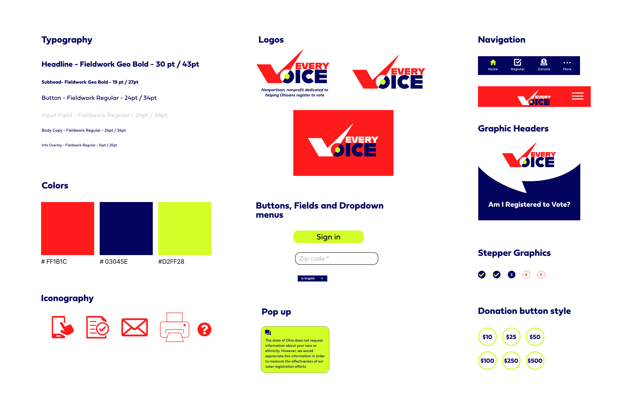
Style Guide
Companion Website
Takeaways
Building a tool for social good allowed me to dive into what would be a very user centric project. It had to meet the needs of a very diverse group. The tone had to be educational and supportive while also being nonpartisan. I really enjoyed the visual design portion of this project. I was able to select the color palette and design the branding for the site.


