-
PROJECT: The Red Cardinal - Dedicated Mobile App
-
ROLE: Research, Visuals, Prototyping, Branding
-
DURATION: February 2022-June 2022
-
Project Vision
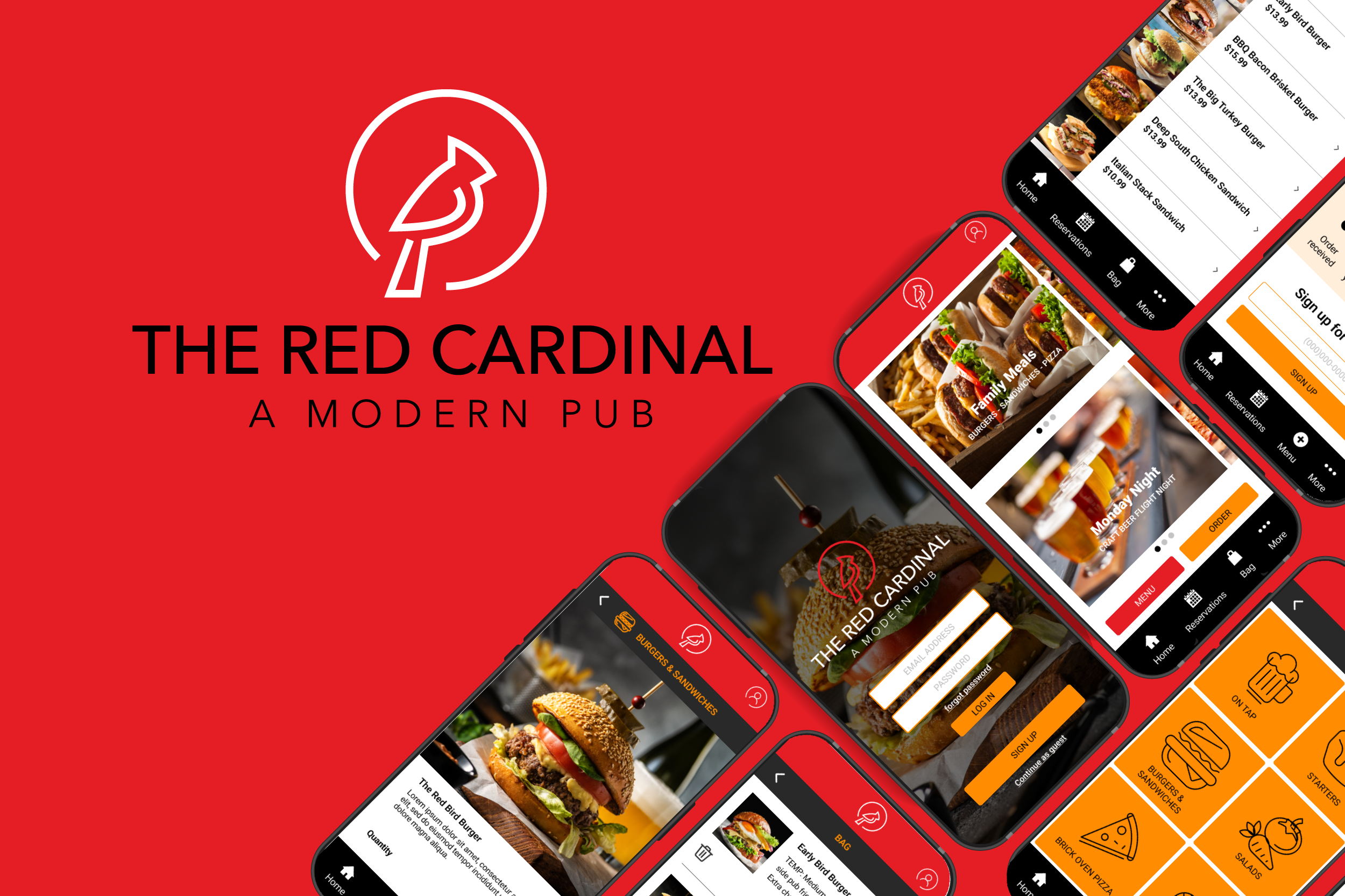
The Red Cardinal is a local modern pub that attracts busy working families as well as many young professionals. For this project, I wanted to create a mobile application for on-the-go order/delivery and menu viewing purposes. I focused on personas, research and a competitive audit to create a goal statement.
-
Challenges
Create an app for a modern pub that allows for group ordering and item customization.
Create a seamless and linear ordering process.
Design a cohesive interface for familiar and unfamiliar users.
Create a user experience that encourages repeat visitors.
User Research
I conducted interviews and created empathy maps to understand the users I’m designing for and their needs. Two primary user groups were identified through research. The first, working adults with families that don’t have time to cook every work night due to family activities. The second, young professionals that are required to order lunches for colleagues and clients and need to impress their superiors with food delivered on time and correctly.
These user groups confirmed initial assumptions about a modern pubs’ customers. Other pain points that were discovered are listed below.
Pain Points
Delivery tracking
It is very important that deliveries are made on time. Late deliveries would mean colleagues and clients would be upset and lose trust.
Group ordering
Having to collect orders individually and enter them into the app can be time consuming and the orders can get entered incorrectly
Food customization
Dietary needs are present as well as picky eaters. Not being able to customize food orders means someone will be unhappy with their meal.
Food description and photos
It’s disappointing to not have a description and or photo of a dish. Creates confusion when ordering and leads to customer’s remorse.
Meet the Users
-

Sarah
Age: 25
Education: BA
Hometown: Chicago, IL
Family: Single
Occupation: Marketing AssistantSarah is a busy, multi-tasking marketing assistant. She is young and climbing the ladder. She needs to impress her superiors. Ordering food for meetings is a daily job function. She needs timely deliveries that meet preferences for a large group. Sarah needs to efficiently collect individual orders from up to 15 people. Leaving the office to pick up food isn’t an option. Often, she isn’t able to track deliveries which makes it difficult to ensure arrival times, food has arrived unexpectedly late or too early and this reflects poorly on Sarah.
-

Samuel
Age: 45
Education: BS
Hometown: Pittsburgh, PA
Family: Married with 3 children
Occupation: Building ContratorSamuel is a Building Contractor. His wife also works outside the home. They have 3 children that are in various weeknight activities. Samuel often works long days and although he enjoys cooking for his family, there are a couple evenings a week that he is either too tired, out of time or his kids have activities. He likes to order dinner from an app and have it delivered. He would like to have greater customization within food ordering apps because his kids are picky eaters. Often, there isn’t a photo of the food or a description, this makes choosing meals difficult and leads to one of his family members not eating the meal that is delivered. Expensive delivery and no customer reward program are also drawbacks.
Competitive Analysis
My goal was to compare offerings and functionality of competitors food ordering apps. I looked at several restaurants that offered ordering and menu mobile applications. We narrowed it down to three direct and one indirect competitor. After reviewing each of the competitors’ mobile apps and websites I found a few gaps in the market which leads to opportunities to stand out.
Opportunities to stand out:
Offer a way to collect group orders
Create order prep and delivery tracking functionality
Research and consider what accessibility functionalities would serve our audience best
Preparing the journey
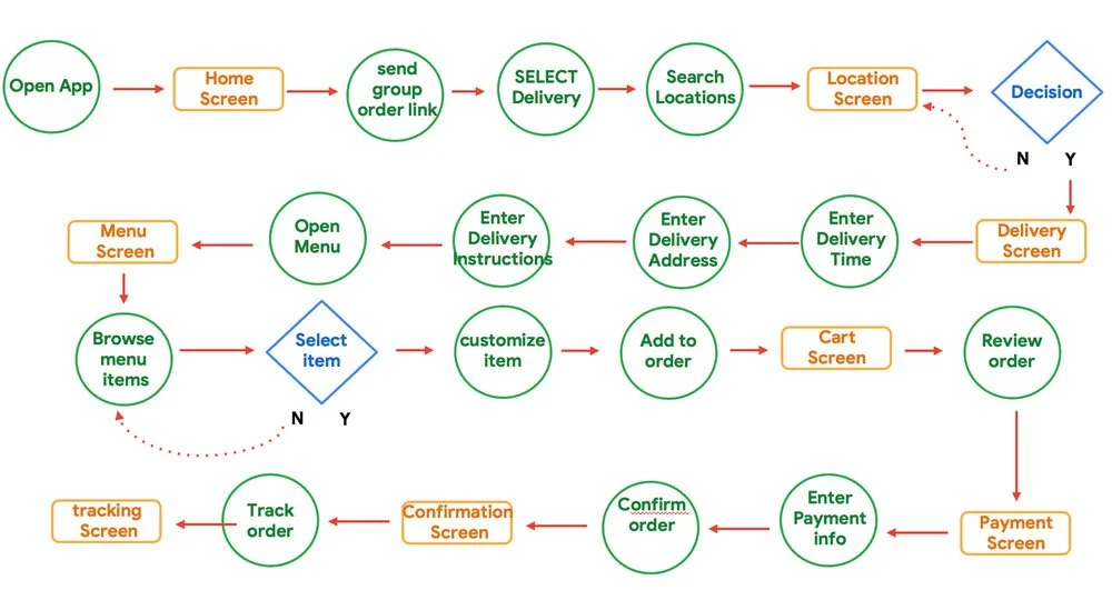
I constructed a user flow of what a basic start to finish journey looks like for a user placing a customized group order for delivery. This helps me in understanding the ways a user can interact with the product, as well as allowing me to see user goals through navigation.
Wireframes
Paper
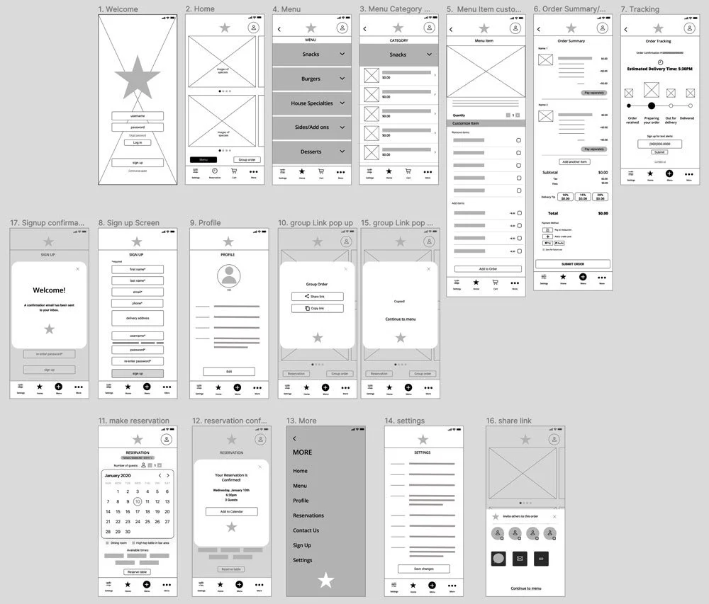
My goal during the wireframing stage was to iterate quickly. I was able to sketch out various versions of each proposed app page. From these iterations, I was able to narrow down the layouts quickly. This exercise allows me to move into digital wireframing with a solid strategy.
Digital
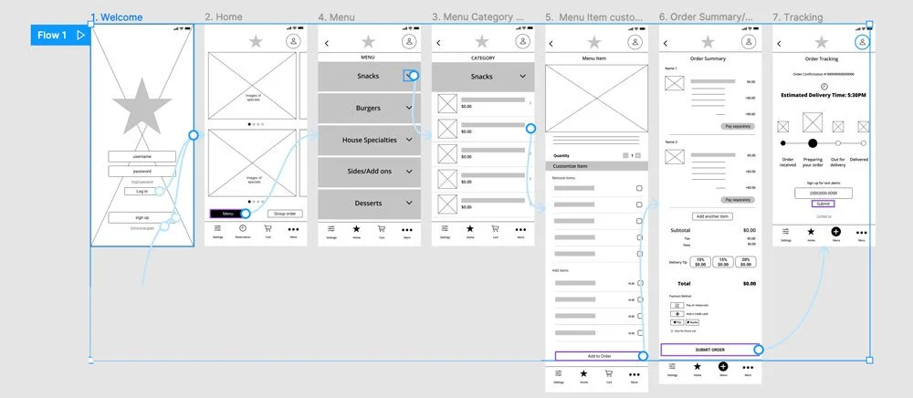
Low-fidelity prototype
The user flow starts on the welcome screen and moves through the ordering process and then to payment and delivery. The user can also create a reservation or signup for the app.
Usability Study #1
The first round of testing was conducted with (5) participants. They were asked to accomplish (6) tasks using the low-fidelity prototype. I observed them and took detailed notes of how they reacted to the app. There were also open-ended questions asked of the participants after completing each task.
Insights:
Based on the theme that the participants want to be contacted by phone, an insight is a phone number field needs added to the signup form.
Based on the theme that the majority of participants want payment options, an insight is that the app needs to offer a variety of payment methods.
Based on the theme that the menu category dropdowns are confusing to some participants, an insight is that labeling needs to be more clear on the menu.
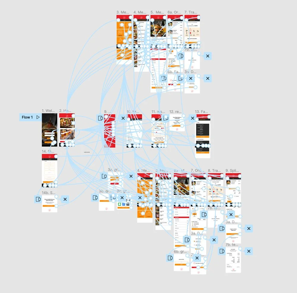
High-fidelity prototype
The user flow starts on the welcome screen and moves through the ordering process whether they choose to create a single or group order and then to payment and delivery. The user can also create a reservation or signup for the app.
Usability Study #2
The second round of testing was conducted with (5) participants. They were asked to accomplish (6) tasks using the high-fidelity prototype. I observed them and took detailed notes of how they reacted to the app. There were also open-ended questions asked of the participants after completing each task.
Insights:
To improve usability, participants suggested that a more well recognized icon, such as a house icon, should be used to represent home screen rather than the red cardinal logo on the navigation menu.
Participants from the second usability study wanted to be able to split a bill when using the group ordering feature. Split bill option should be added to the Group order checkout screen
Participants from the second usability study were concerned that the color contrast was not up to accessibility standards. To correct the issue on the buttons the type color should be changed from white to black.
Iterations based on insights from Usability Study #2
Style Guide
Takeaways
Throughout this project I have learned the benefits of conducting research and usability studies. I feel these are so important in building an app that creates an experience for the user that keeps them coming back. I’ve also learned the importance of accessibility considerations. Creating an app that everyone can use is good for all.
What People Are Saying
“I really liked your case study, it was the perfect combination of visual elements and your process to get there.”
“The app contained most of the necessary features including a personal profile. Food order was step-by-step, all inclusions of add-ons and additional customizations were great and a summary of the order gave a preview of what was ordered before being submitted. The ability to view a payment method or pre-insert one saves time when it comes to the actual ordering process. The basic and straightforward navigation made everything simple and would be something I would use in the future.”
“I loved this! I am a user that is your target demographic and I definitely want to go out and ordering something from a pub now.”


